
Read through the below information for details or skip ahead to a specific section.
April 2026
Saved Views are here! We have released the the new "Saved Views" feature that allows you to apply and save filters for viewing your CARE data in a customized way. These saved views can also be shared with others in your organization that also have the ability to view the CARE data.
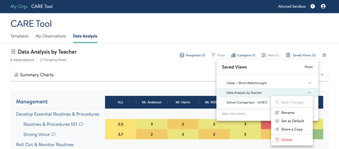
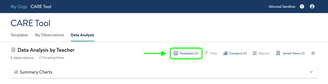
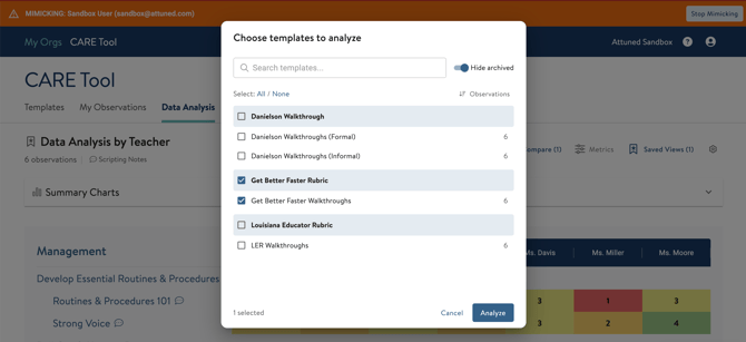
With this new feature, we've also made it easier to select templates to visualize the data. Instead of navigating back and forth on separate pages to select the desired templates, you are now able to click on the "Templates" option and stay on the same page by selecting templates from the pop up window.
If you would like to watch a quick how-to video on using Saved Views, click here.
To read a step-by-step guide on using Saved Views, click here.
September 2025
We have made updates to the CARE tool goals feature to make adding new goals and tracking completed ones much easier for users.
When navigating to the Goals section of the tool, you'll see the layout is now divided into Current Goals and Completed Goals. You can export your goals in a CSV file using the "Export CSV" button. You can add resources and links to specific goals as well using the upload icon and link icon under "Resources" in the goals table.


To add a new goal, click the "+ New Goal" button in the top right corner. A pop up window will appear for you to select the following fields:
- Goal Type: Whether the goal is assigned to an Individual (observee) or a group.
- Teacher: Selecting from the observees list a single teacher or multiple teachers.
- Goal Indicator: Selecting from the list of established indicators from your templates.
- Descriptor: Whether the goal requires a selected metric.
- Status: In Progress, Not Mastered, and Mastered are the options to choose from.
- Due Date: Select using the calendar icon or typing in the date.
- Coach: An optional field to complete for who is coaching the individual(s).
- Description and Progress Notes: To provide more detail and monitor progress if needed.
You can also reference recent observations that have been logged for the selected Indicator and selected teacher if applicable. This can be useful information as you create goals for your teachers to see their previous observation information. This will only appear as an option if there is recent data for that specific teacher and indicator.

Any goal that has been marked as "In Progress" will appear under "Current Goals". Any goal that has been marked as "Mastered" and "Not Mastered" will appear in the "Completed Goals" section.
May 2025
We have removed the "Archived" section in the Templates tab of the CARE Tool. Rather than crowd the page with an entire section of archived templates, you now have the ability to simply filter out archived templates for your org.
The default setting is to hide any archived templates. To view them, you can click the Filter button and toggle off the "Hide Archived" option. There is an option to hide/view any disabled templates as well.  Once you've done this, you will see archived templates appear. They will be highlighted in orange under the template Status.
As a reminder, to unarchive, disable, or enable a template, click "Edit" next to the template you'd like to change. You'll then see the option to make the changes to the template on the righthand side of the screen.

March 2025
There are new updates this month! We have a new layout for the Coaching Dashboard, as well a brand new Visualizer on the Data Analysis tab. Please read below for details.
Skip to updates on the Coaching Dashboard here!
Data Analysis
The majority of our updates this cycle are on the Data Analysis tab of the CARE Tool. We have created cleaner, more organized ways for you to compare observation data and understand progress and areas of focus. Click on the update you'd like to read more about:
Analyze Button: When clicking on observation templates to compare, the button now reads as "Analyze [#] of Templates" instead of "Compare" and "View". To view a single template, you can click on the template name. 
Disaggregating the Data: Once you’ve chosen your templates and clicked Analyze, you’ll see our new data visualizer.. This visualizer is more powerful than the old one and uses your whole screen to display the data. All your controls are in three buttons at the top of the screen (Metrics, Filters, and Group By) as shown below.
- Use the Filter button to restrict your display to only the observations you want to see.
- Use the Metrics button to show which indicators you want to see in the heat map and the graph.
- Use the Group button to categorize the data in columns in the heatmap and in the horizontal axis of the graph.


 Date Ranges: If you choose to compare data based on custom date ranges, you will see a calendar pop up to select the date ranges they'd like to compare.
Select the start date and end date to use. Note that these dates you've selected will be saved as options if you'd like to use them again in the future. You can always delete them by clicking the "X" if they are not necessary.
Dates you see shaded in GREEN indicate that at least one observation was logged on that day.
 You can add more than one date range to compare your data. If you choose to add another date range, you will see that the start date will auto populate to be the following day from your last date range. For instance, if your last date range ends on 12/31/2024, adding another date range will suggest the start date to be 1/1/2025. You can override this by selecting or typing the desired date.
Once you've selected the dates you want to use, click Apply to view the comparison in the data visualizer.
 A video of these steps is below:
Summary Charts: You'll see that on the new Data Analysis page, the charts that had been viewable previously are now collapsed under "Summary Charts". To view these, click the down carrot on the right side of the bar to expand it. 
The reason for hiding these charts was to allow for users to view the "meatier" data and not need to scroll down to get started on their analysis. To hide the charts again, click the up carrot. 
Metrics Chart: There is also a chart at the bottom of the heat map that displays the same data. . This chart can be viewed as a bar chart or a line graph. Although the metrics may all be selected to view the data in the comparison heat map, the Metrics Chart allows you to remove metrics to simplify the chart.
For viewing multiple metrics, we recommend using the line graph option so you can more easily see progress over time.

Once you've switched to the line graph, you can click on the names of metrics at the top of the chart to remove them from the chart.
 These metrics will still be visible in the heat maps on the rest of the page, but in the metrics chart itself they will be removed to show a cleaner view. You can also hover over each data point to view the data in a pop up in the chart.
 See the video below showing how to manipulate the Metrics Chart:

Coaching Dashboard
The new format of the Coaching Dashboard can be seen below.
For CARE Tool Users/Admins:
Note that there is now a Filter button available to filter observations by a number of categories (see below).

 For Teachers:
Teachers will have the same Filter button available to filter their own observations. Observations can be filtered by a number of categories (see below). 

January 2025
Previously, teachers were able to view their observations before the reviewer had submitted them as complete.
We have updated this to no longer allow teachers to view observations unless they have been marked as complete. A teacher will not be able to view an observation that is in progress or incomplete.
If you have questions about any of these updates or need further support, reach out to us! Send us a chat or email us at support@attunedpartners.com.